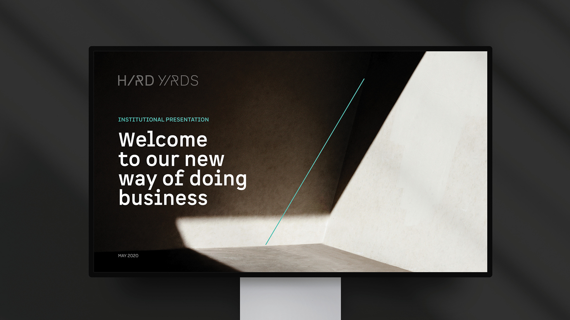
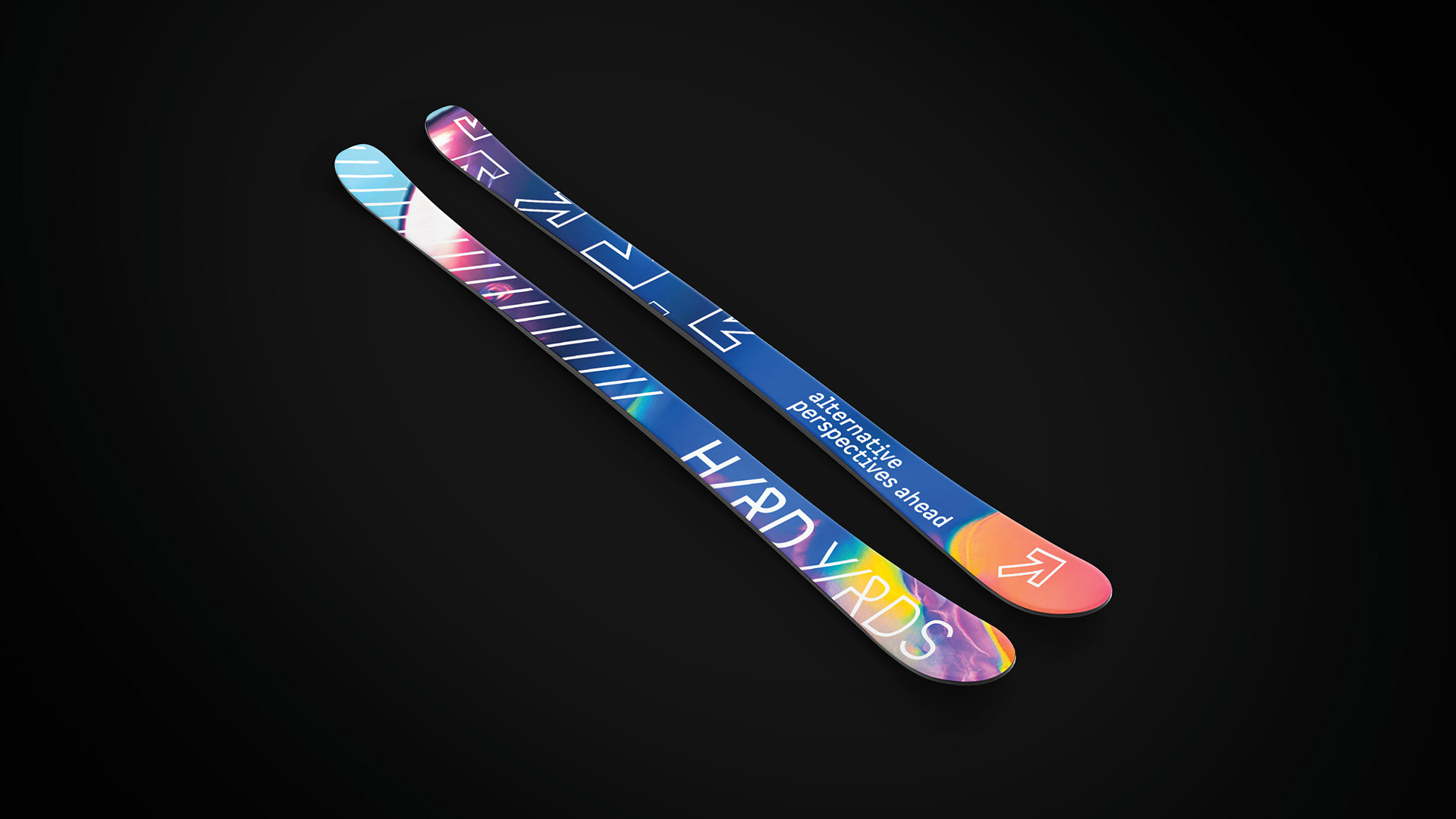
Hard Yards Global is a new type of private equity firm looking to stand apart in the way they do business, invest and grow their asset base. They come from different backgrounds and skills, but they have the shared belief of creating a positive impact in the world.
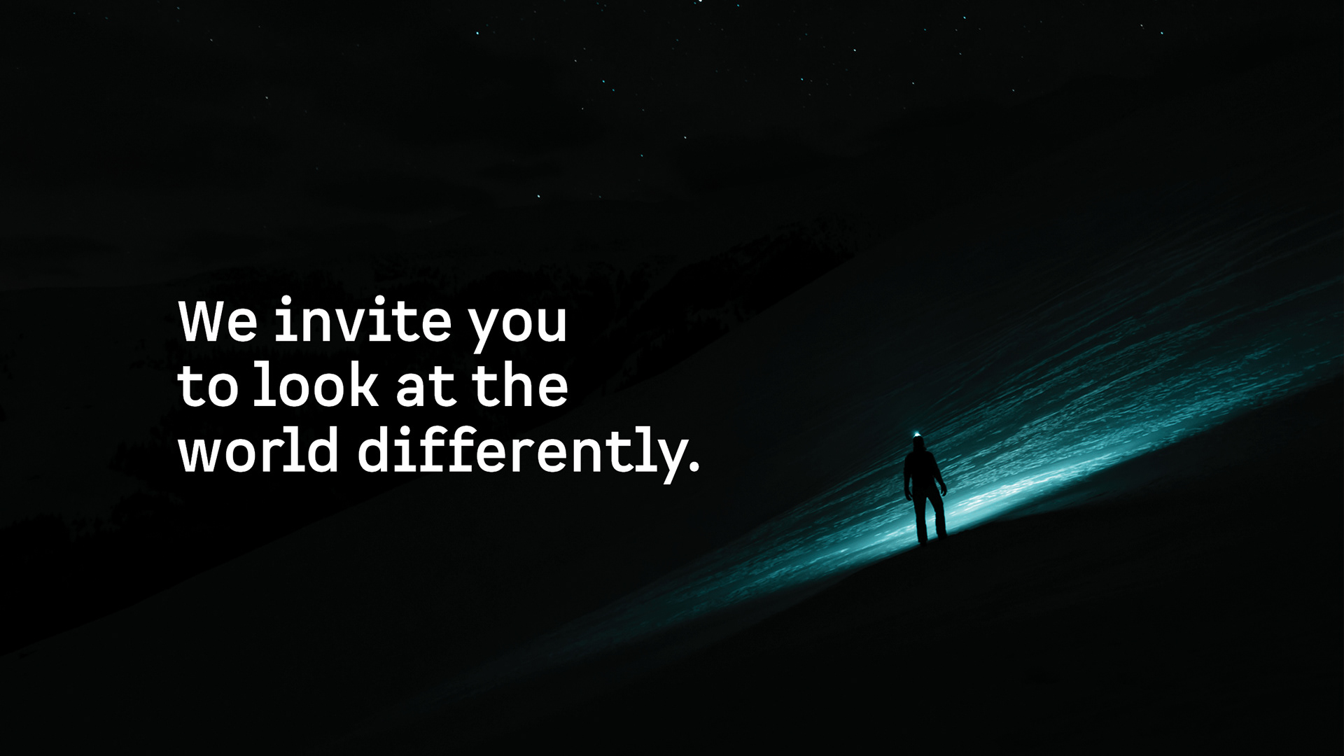

For those bold enough to look twice, there’s always a reward.
For Hard Yards Global, business is the art of looking at the world more deeply to uncover a more positive outlook. Its philosophy isn’t just about making the right investments, but about making the unexpected ones. This alternative perspective drives them forward and it's directly translated into the logo.
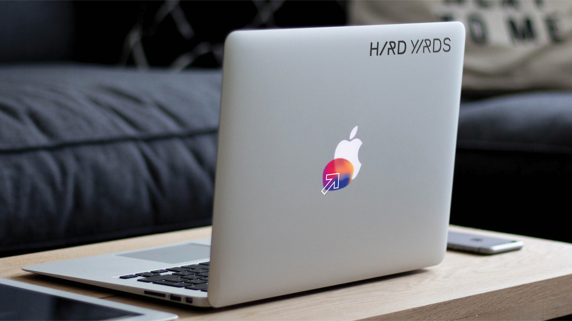
The letters "a" are slightly hidden among the other letters. They are represented by the combination of the slash and the stylized stem of the letters "R". It also produces the illusion of an upward arrow, which points to positive returns.
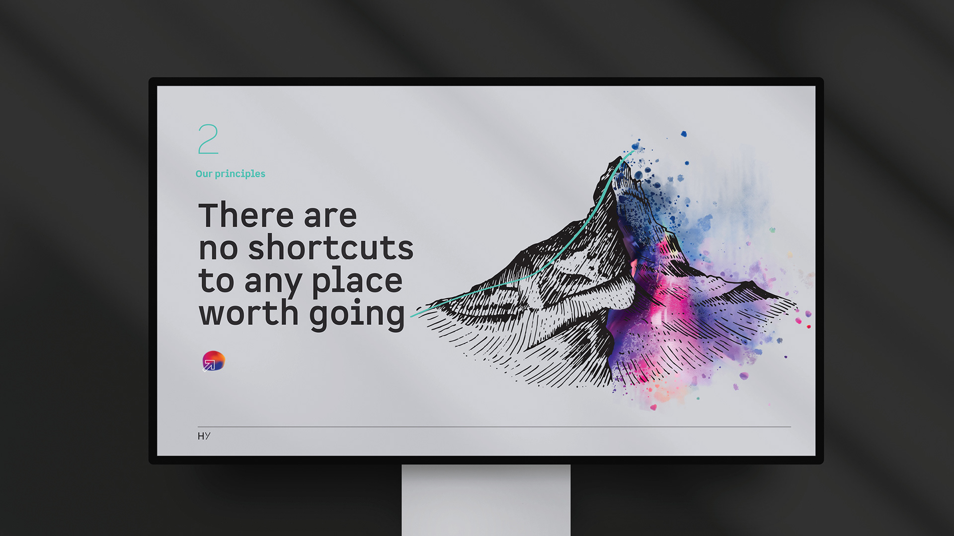
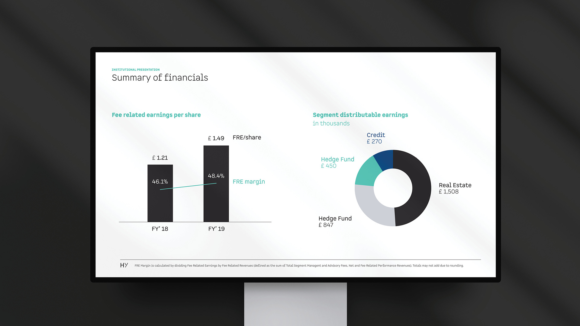
As the visual identity system is expanded, the slash and the green accent color play a significative role on establishing the mood for the brand. The subtlety of its universe is composed by the use of black and gray. The system is complemented with a few splashes of color through iconography.
